Build a Web Component with Nutmeg

You're in love with web components. I know. So am I. Let's not waste time rehearing their benefits and get right to building one. In a previous post, I wrote about building a web component from scratch. This time I'll use Nutmeg, a tool (developed by my Bendyworks colleague Abraham Williams) that helps you quickly build, test, and publish a web component. Nutmeg sets you up with a component scaffold that has best practices and testing baked in. It takes care of the boilerplate so that you can focus on the component itself.
Using Nutmeg, I'm going to create a component that displays information about a Google Developer Group. The component will take a GDG's name, fetch info about the GDG from Meetup's API, and display it like this:

You can check out a live demo of the finished product on this Codepen.
Generate a Component
The first step is to generate a base component using Nutmeg's CLI. Install the CLI globally using NPM or Yarn and then run the CLI's new command in your terminal. The command's first argument is the name of your component, in this case "gdg-group." (The name must contain at least one hyphen; the hyphen tips off your browser that it's dealing with a custom element.) The new command also takes a list of properties and their types. The gdg-group component take two properties: a string called "urlName" and a boolean called "showNextEvent". (Unlike the component's name, its property names should not contain hyphens. At least not of this writing. See the issue about this for updates.)
npm install --global @nutmeg/cli
nutmeg new gdg-group urlName:string showNextEvent:boolean
When you run the new command, Nutmeg generates a directory that contains the new component and its dependencies, as well as some initial tests. From within the new directory, run npm run serve and Nutmeg will launch a browser and display a demo of your brand new baby component.
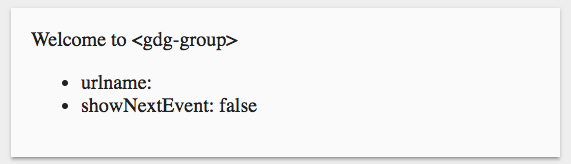
This doesn't look like the final component and it doesn't do anything yet, but we're off to a grate start. Webpack is generating bundled files for distribution, tests are ready to go, and all the basic set-up is taken care of.
If you open the component class file in the src directory, you'll find a custom element written in Typescript. It looks pretty much like any other custom element; most of the methods are part of the standard. But there are a few differences.
import { Seed, Property, html, TemplateResult } from '@nutmeg/seed';

export class GdgGroup extends Seed {
    @Property() public urlName: string;
    @Property() public showNextEvent: boolean;
}
The first line imports dependencies from the Nutmeg web component base class (Seed and Property) and from a templating tool called lit-html (html, TemplateResult).
Unlike a standard custom element, this one inherits from Seed, which inherits from HTMLElement. Nutmeg's Seed is a parent element class that attaches the Shadow DOM, performs a one-time upgrade of complex attributes into JSON-parsed properties, creates a shadowRoot selector shortcut, and accomplishes other friendly chores.
The properties, which must be valid Typescript types, are the component's public API. The @Property decorator creates getters and setters and automatically renders or re-renders the properties when they are set or changed. Primitive types (boolean, string, number) are also reflected to the DOM.
Run the Tests
Nutmeg also generates some Mocha tests for the component. By default, each of the properties that you define in the new command will be added to a test fixture and tests will ensure that your properties render correctly. For example, the test for the urlName property, below, sets a urlName on the element and verifies that the value is displayed in the default template.
describe('urlName', () => {
  beforeEach(() => {
    component = fixture(
      '<gdg-group-test urlName="Pickle"></gdg-group-test>'
    );
  });
  it('is rendered', () => {
    expect(component.$('.content').innerText)
      .to.include('urlName: Pickle');
  });
});
As you modify your component template and properties, you can build on the these starter tests. You can see the tests pass by running npm run test.
Modify the Component
The GDG component will fetch data from the Meetup API, save the group name and the name and date of the next meeting in properties, and display those properties in the template.
@Property() public groupName: string;
@Property() public eventName: string;
@Property() public eventDate: string;
Before implementing all of that, let's add some new tests. The tests will stub the request to the Meetup API and test that the property values are extracted from the data, set correctly, and displayed in the component.
This will require some data, so I've added a file to the test directory called test-data.json. It contains the response that I would expect to receive from the API. Using Sinon, I fetch data from that file instead of making a real network request. Even though the test-data.json file is right next to my test file in the test directory, in the example below I am fetching it from the url ./base/test/test-data.json because this allows the Karma test runner to find it.
describe("<gdg-group>", () => {

  let component, stub;

  beforeEach(async () => {
    let response = await fetch("./base/test/test-data.json");
    stub = sinon.stub(window, "fetch").resolves(response);
  });
  afterEach(() => {
    stub.restore();
  });

  describe("with urlName only", () => {
    beforeEach(() => {
      component = fixture(
        "<gdg-group urlName='gdg-madison'></gdg-group>"
      )
    });
    it("should display group name", () => {
      expect(component.$(".content").innerText)
        .to.include("GDG Madison");
    });
    it("should not display next event", () => {
      expect(component.$(".content").innerText)
        .to.not.include("Build a Web Component with Nutmeg");
    });
  });
});
I will also write tests for the showNext event property but I won't bore you with the details. You can see all the tests here.
The test are going to fail, of course, because the nothing has been implemented yet.
Now to make the tests pass! To do that, we need to update the template and add a request to fetch the data. To get data from Meetup, I have set up a little Firebase function. (The code is here.) This is not completely necessary but it makes the component a little bit easier for developers (you!) to use. This method gets called from the component's connectedCallback, which fires when the component is added to the DOM.
  private fetchGDGInfo(): void {
    let self = this;
    fetch(`https://gdg-group-72e25.firebaseapp.com/meetup/${this.urlName}`)
      .then(res => {
        return res.json();
      })
      .then(json => {
        self.groupName = self.groupName || json[0].name;
        const event = json[1][0];
        self.eventName = event.name;
        self.eventDate = event.local_date;
        self.eventLink = event.link;
      })
      .catch(err => self.handleError(err));
  }
This function fetches the data and assigned values to the new properties. If the user of the component wants to override the official Meetup GDG group name, they can do that by setting a groupName on the element. The code above checks to see if the groupName is already set before assigning it the value fetched from Meetup.
The last step is to add those properties to the template. You'll notice below that the template is a JavaScript template literal preceded by "html". This is the syntax for lit-html's template wrapper. The urlName and groupName properties are displayed directly in the template. The showNextEvent boolean determines if the nextEvent property will be displayed. The nextEvent property is a helper method that formats the event name and date for presentation. You can see it all here.
public get template(): TemplateResult {
  return html`
    <div class="content">
      <a href="https://www.meetup.com/${this.urlName}/">
        <img src="https://gdg-logo-generator.appspot.com/gdg_icon.svg" width="70px" />
        <div>
          <h1>${this.groupName}</h1>
          ${this.showNextEvent ? this.nextEvent : ""}
          <slot></slot>
        </div>
      </a>
    </div>
  `;
}
With an updated template, the tests are passing! We have a working web component and the serenity that comes with green tests. Time to release the fledgling component into the world. It's easy to do. I'll spruce up the README that Nutmeg generated and run npm publish. (If you don't have an NPM profile, you'll need to set that up first.) Now the new component is publicly available on NPM. If you have any use for it, you're welcome to it. Use it. Improve it. Better yet, make your own component and tweet it to me at @pblatteier. Happy coding!
Resources
- Custom Element Best Practices
- Custom Elements Everywhere
- MDN on Web Components
- Nutmeg
- Polymer
- Stencil
- Webcomponents.org
- lit-html