A month of Flutter: user registration form

After a user navigates to the registration page, they should be able to enter their name and agree to the Terms of Service/Privacy Policy.
I'll start by updating RegisterPage to render a RegisterForm widget that I'll create in a minute. Wrapped around the form is a SingleChildScrollView. This scroll view is for when the keyboard in open and the form can't fit in the visible space.
Scaffold(
  appBar: AppBar(
    title: const Text('Register'),
    centerTitle: true,
    elevation: 0.0,
  ),
  body: const SingleChildScrollView(
    child: Padding(
      padding: EdgeInsets.fromLTRB(16.0, 16.0, 16.0, 8.0),
      child: RegisterForm(),
    ),
  ),
);
The majority of the work is going to be handled in the new RegisterForm. The initial StatefulWidget structure is based on Flutter's building a form with validsation recipe.
class RegisterForm extends StatefulWidget {
  const RegisterForm({Key key}) : super(key: key);

  @override
  _RegisterFormState createState() => _RegisterFormState();
}

class _RegisterFormState extends State<RegisterForm> {
  final GlobalKey<FormState> _formKey = GlobalKey<FormState>();
  bool _agreedToTOS = true;

  @override
  Widget build(BuildContext context) {
    return Form(
      key: _formKey,
      child: Column(
        crossAxisAlignment: CrossAxisAlignment.start,
        children: <Widget>[
          TextFormField(
            decoration: const InputDecoration(
              labelText: 'Nickname',
            ),
            validator: (String value) {
              if (value.trim().isEmpty) {
                return 'Nickname is required';
              }
            },
          ),
          const SizedBox(height: 16.0),
          TextFormField(
            decoration: const InputDecoration(
              labelText: 'Full name',
            ),
            validator: (String value) {
              if (value.trim().isEmpty) {
                return 'Full name is required';
              }
            },
          ),
          Padding(
            padding: const EdgeInsets.symmetric(vertical: 16.0),
            child: Row(
              children: <Widget>[
                Checkbox(
                  value: _agreedToTOS,
                  onChanged: _setAgreedToTOS,
                ),
                GestureDetector(
                  onTap: () => _setAgreedToTOS(!_agreedToTOS),
                  child: const Text(
                    'I agree to the Terms of Services and Privacy Policy',
                  ),
                ),
              ],
            ),
          ),
          Row(
            children: <Widget>[
              const Spacer(),
              OutlineButton(
                highlightedBorderColor: Colors.black,
                onPressed: _submittable() ? _submit : null,
                child: const Text('Register'),
              ),
            ],
          ),
        ],
      ),
    );
  }

  bool _submittable() {
    return _agreedToTOS;
  }

  void _submit() {
    _formKey.currentState.validate();
    print('Form submitted');
  }

  void _setAgreedToTOS(bool newValue) {
    setState(() {
      _agreedToTOS = newValue;
    });
  }
}
It starts out with a GlobalKey to uniquely identify the form. This will be used later on to validate the state of the form.
There is also _agreedToTOS, this is a boolean property that is updated to match if the TOS/PP checkbox is checked. If a user unchecks the checkbox, this boolean will turn to false and the submit button will be disabled.
That brings up an intersting API design for OutlinedButton:
If the onPressed callback is null, then the button will be disabled and by default will resemble a flat button in the disabledColor.
So if _agreedToTOS is true, _submittable will be true and the button will have a onPressed callback. If the value is false, the callback will be set to null and the button will be in a disabled state`.
OutlineButton(
  highlightedBorderColor: Colors.black,
  onPressed: _submittable() ? _submit : null,
  child: const Text('Register'),
)
The TextFormFields are pretty straightforward. They get some decoration with a labelText since you should always label your inputs. They also get a validator that just checks to see if it has a value or not.
TextFormField(
  decoration: const InputDecoration(
    labelText: 'Nickname',
  ),
  validator: (String value) {
    if (value.trim().isEmpty) {
      return 'Nickname is required';
    }
  },
),
I choose to go with nickname and full name because I don't want to make assumptions about names.
TextFormFields are by default filled but I like outlined so I'm updating the theme. With the addition of these theme changes, the ThemeData definition was growing pretty large so I moved it to its own theme.dart file.
ThemeData(
  brightness: Brightness.light,
  primaryColor: Colors.white,
  accentColor: Colors.white,
  scaffoldBackgroundColor: Colors.white,
  textSelectionHandleColor: Colors.black,
  textSelectionColor: Colors.black12,
  cursorColor: Colors.black,
  toggleableActiveColor: Colors.black,
  inputDecorationTheme: InputDecorationTheme(
    border: const OutlineInputBorder(
      borderSide: BorderSide(color: Colors.black),
    ),
    enabledBorder: OutlineInputBorder(
      borderSide: BorderSide(color: Colors.black.withOpacity(0.1)),
    ),
    focusedBorder: const OutlineInputBorder(
      borderSide: BorderSide(color: Colors.black),
    ),
    labelStyle: const TextStyle(
      color: Colors.black,
    ),
  ),
);
The important change is the addition of inputDecorationTheme. This sets the border style to be outlined and customizes the color based on the state of the input.
There are a couple of other theme changes:
toggleableActiveColorchanges the color of the checkbox.cursorColorchanges the color of the blinking cursor in an input.textSelectionColorchanges the highlight color when text is selected.textSelectionHandleColorchanges the color of the handlers to select more or less text.
One addition I made was to wrap the text for the checkbox in a GestureDetector so that if a user taps on the label, it will toggle the checkbox value.
GestureDetector(
  onTap: () => _setAgreedToTOS(!_agreedToTOS),
  child: const Text(
    'I agree to the Terms of Services and Privacy Policy',
  ),
)
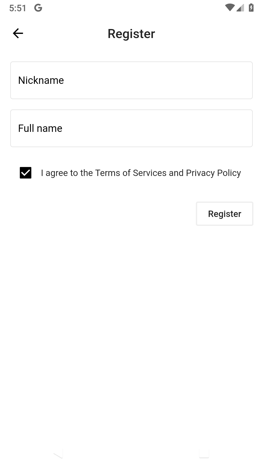
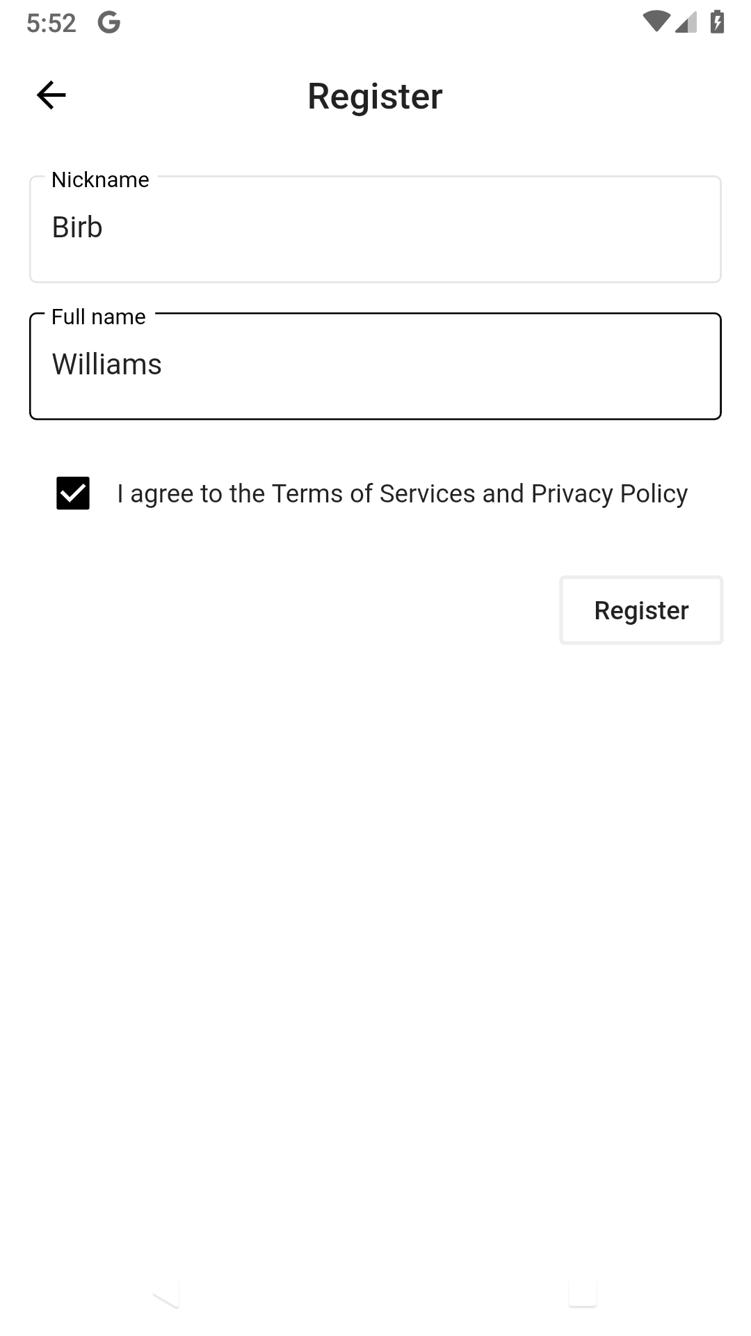
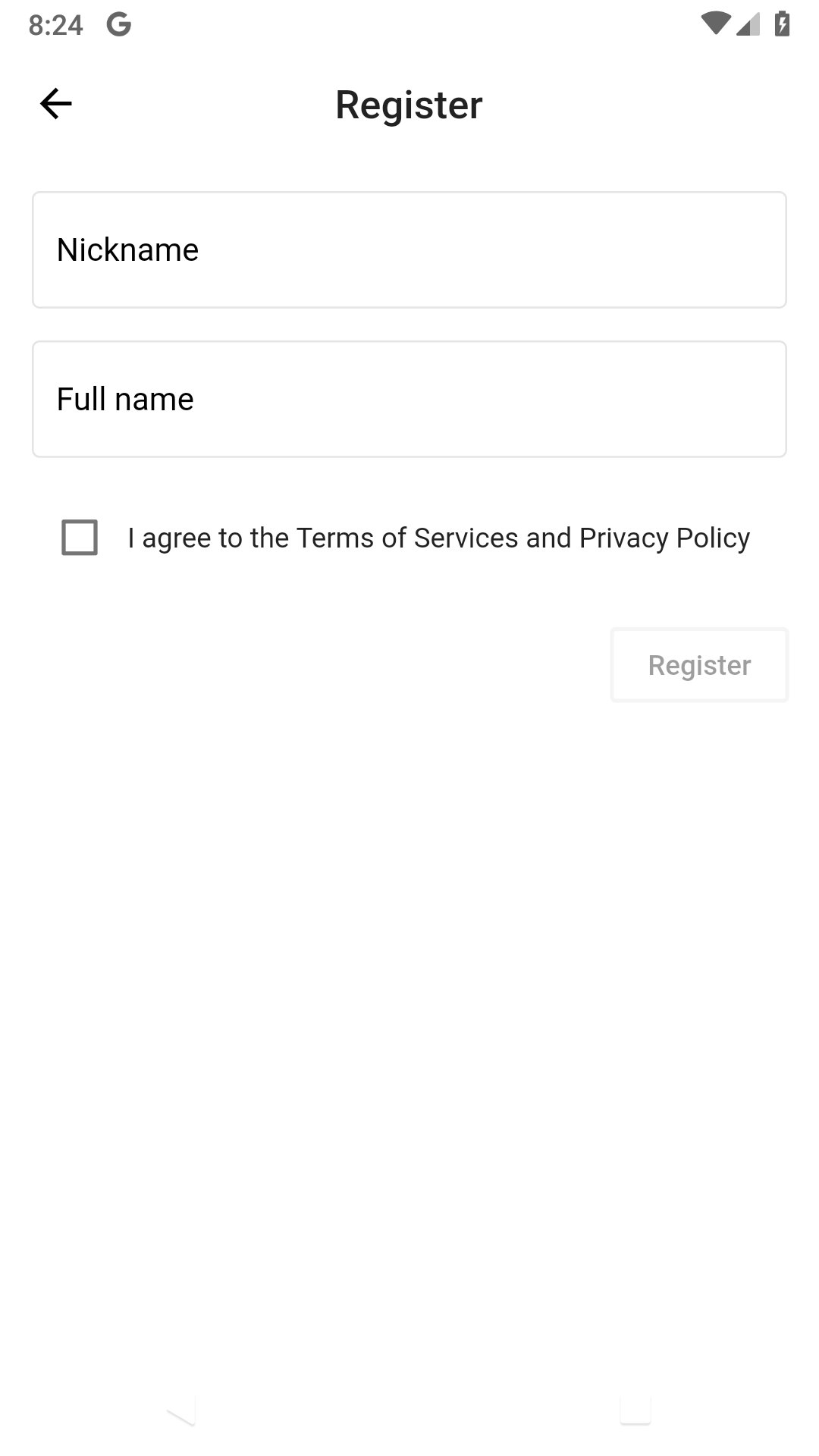
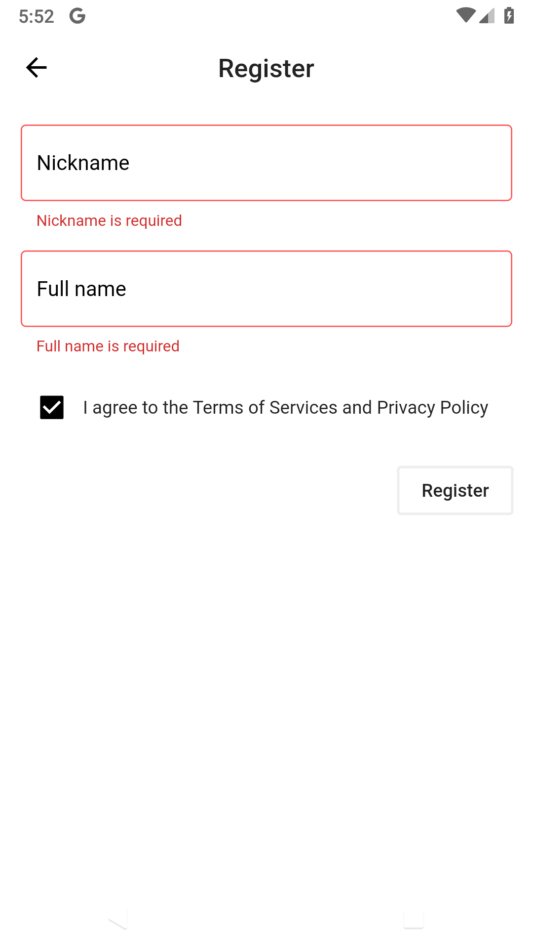
Here are some screenshots of the registration form in several different states:
Empty form:
Filled out form:
Disabled form:
Form with errors
Come back tomorrow to see how I'll test the various states of the form.