Implementing React Native Responsive Design Part 1 : Limiting and Scaling
Phones and tablets come in all shapes and sizes. Now that Mac, Windows and tvOS support is in the works, the variation in screen geometries will only grow even more varied. On the web we have media queries and responsive layouts via Cascading Style Sheets. What tools does a React Native developer have to provide similar layout flexibility? As usual, the answer is “that depends”. What does your app do? There is no one size solution for all apps. In this series of posts we will introduce the tools React Native provides and see how to apply them to develop apps that notice and take advantage of the available screen real estate.
React Native gives us device independent pixels (DIP) which helps to abstract away the varying screen densities, but doesn’t help with the wide variety of screen sizes. Some apps have fairly simple layouts that scale nicely from an iPhone SE at 568x320 pixels to a 12in. iPad Pro at 1024x1366. But those instances are pretty rare. Even in those cases you sometimes want to improve the user experience by taking better advantage of the extra screen real estate. How can we build UIs that adapt to the device screen size like we would on the web? Here are some strategies for building the app of your dreams.
Limiting screen size support
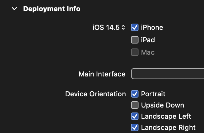
For some apps, simpler is better. You can choose to not support tablets and even remove rotation support. Removing rotation support is particularly user unfriendly so only choose that option if you have a really good reason to do so. For iOS, in XCode you can uncheck the iPad checkbox in General/Deployment Info and uncheck rotation options if you choose.
For Android, in the AndroidManifest.xml file you can find the supports-screens section and set the largest screen sizes to false. To remove rotation support, just find the
<supports-screens
  android:anyDensity="true"
  android:smallScreens="true"
  android:normalScreens="true"
  android:largeScreens="false"
  android:xlargeScreens="false"
  android:resizeable="false"
/>
<activity
  ...
  android:screenOrientation="portrait"
  ...
>
Even if this option makes the most sense for your app, keep reading. Later we will cover font scaling which you should consider supporting for your users with low vision.
Screen scaling
Some apps can fairly easily support tablet screen sizes using flexbox or percents to partition the screen into sections. This works well if the same layout works for all screen sizes. Scaling your app in this way requires choosing image resolutions and font sizes to complement the screen size of the device.
Device Independent Pixels
Screens come in a dizzying array of densities from the original iPhone at 163 pixels per inch to modern phones with densities greater than 460ppi. React Native helps us out with Device Independent Pixels which smooth out most of those size differences for us. If you define a button with a height of 80, it will be approximately half an inch tall on all devices. In a related manner, for local images, the React Native Image component will even correctly choose between image.png, image@2x.png and image@3x.png to match the device’s resolution. For local images it may be useful to have small, medium and large versions of key images to handle differing screen sizes with images that are sharp for their context. As usual, there is a tradeoff here. Adding more images gives a sharper picture but also increases the download size of your app.
Image scaling
One really nice feature of the React Native Image component is that you can pass an array of sourceImage objects the Image component. This array of objects includes source, width and height. The component will use the size of the container to pick the image from the list that is the best match. If you prefer, you can also have complete control of this process by measuring the width of the container on layout and using PixelRatio.getPixelSizeForLayoutSize to translate DIPs into physical device pixels. Here's a snippet that demonstrates this technique.
import dogSmall from './assets/dog_640.png'
import dogBig from './assets/dog_1280.png'
  ...
  const images = [
    Image.resolveAssetSource(dogSmall),
    Image.resolveAssetSource(dogBig),
  ]
  ...
  <Image style={styles.image} source={images} />
Font scaling
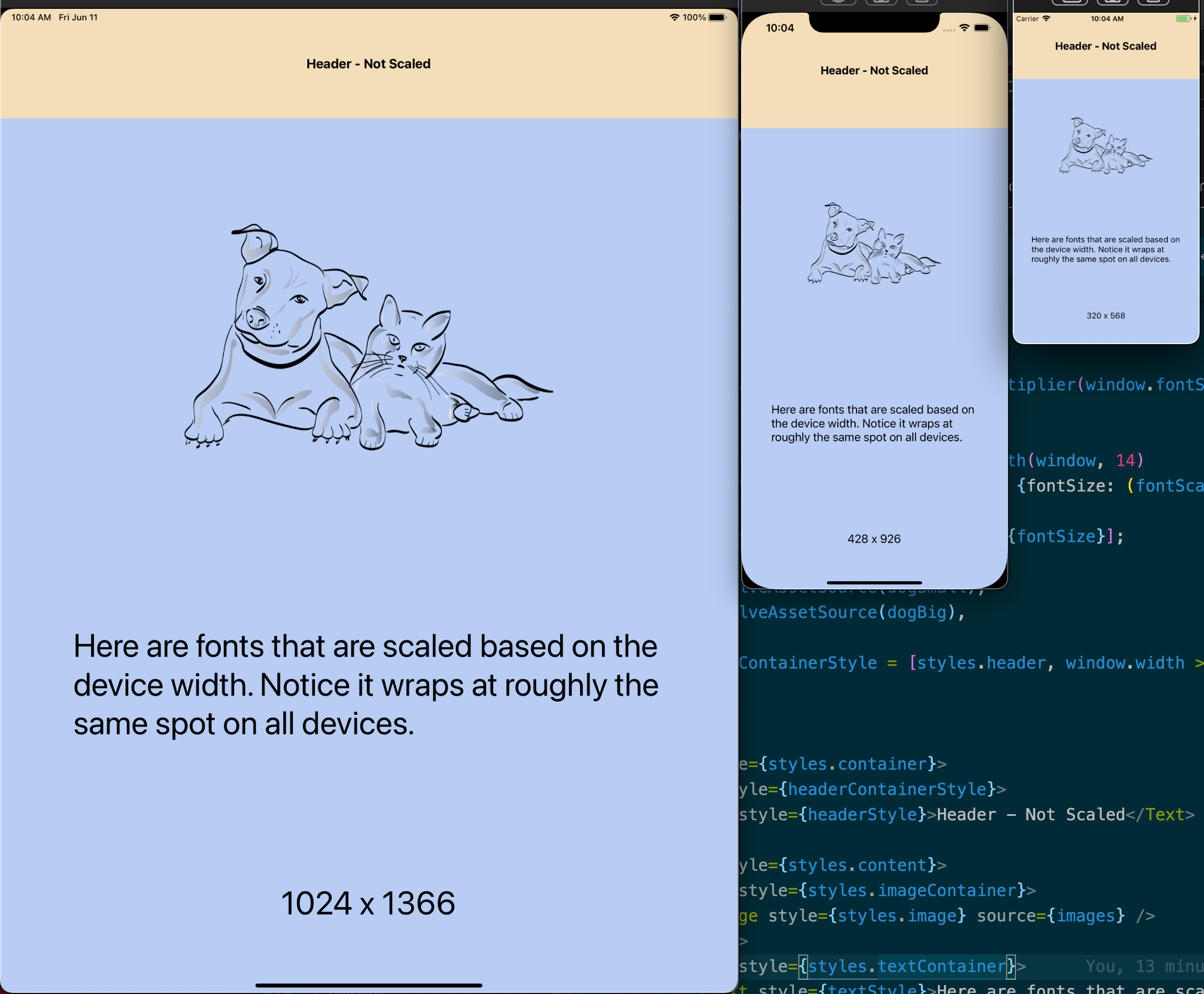
Font sizes are also automatically scaled based on the device's pixel density to keep font sizes similar across devices. However, if your app is using the same layout scaled across all device sizes, you will likely need to do some amount of adaptive font sizing. If you have a layout section that is 20% of the devices' height, the text within it will look crowded on smaller devices and sparse on larger ones. Another part of the font size equation is whether the user has set a text size preference on their device. React Native supports the device text size preference out of the box so your text may look bigger or smaller to some users than you expected. React Native provides PixelRatio.getFontScale to give you an idea of your user's preference. If getFontScale matches the number reported by PixelRatio.get, the user has no preference set. Setting the text size relative to the window width gives you text that wraps to roughly the same number of lines on all screen sizes, but may not always be what you want. One way to handle that is the following.
function getFontSizeByWindowWidth(windowWidth, fontSize) {
  const baseWidth = 320; // width of smallest iPhone
  return PixelRatio.roundToNearestPixel(fontSize * (windowWidth / baseWidth));
}

const fontSize = getFontSizeByWindowWidth(window.width, 14)
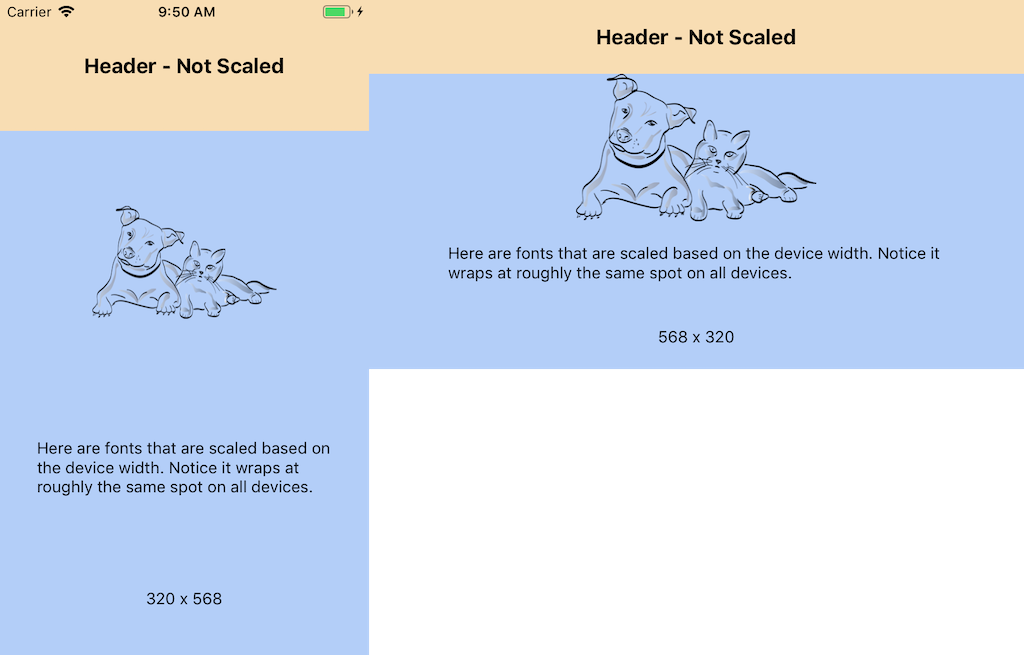
The biggest gotcha with scaling in proportion to window width is orientation. If the user rotates their device the window width will change and the font size will recalculate. This is usually bad. A small update to the sample code can take care of this by always using the smaller of width and height so the text size stays consistent during an orientation change. Here's a code snippet and screenshots to demonstrate this refinement.
function getOrientation(window) {
  return (window.width < window.height) ? 'portrait' : 'landscape'
}

function getFontSizeByWindowWidth(window, fontSize) {
  const baseWidth = 320; // width of smallest iPhone
  const width = (getOrientation(window) == 'portrait') ? window.width : window.height
  return PixelRatio.roundToNearestPixel(fontSize * (width / baseWidth));
}

const fontSize = getFontSizeByWindowWidth(window, 14)
Putting this all together gives us an app that scales nicely no matter the screen size of the device. Stay tuned for the next episode where we will dive into building layouts that change based on screen size and orientation. If you would like to see these concepts in situ, here's a screenshot and a link to an Expo Snack. It is a blank starter template with a few tweaks to demonstrate the concepts we've covered so far.