Implementing React Native Responsive Design Part 2 : Adapting

Building phone apps used to be simpler. There were a small number of phone sizes and an even smaller number of screen sizes to support. Your app always took up the whole screen so developers tended to target particular screen sizes and exact pixel dimensions. As mobile developers we have been going through the same mental shift that web developers went through almost a decade ago. Apps need to be able to adapt to differing screen sizes and still look really good.
For a long time, React Native could give you screen size and not the size of your app window. This allowed for some amount of responsiveness, but as the number of devices grew and multitasking options became available, apps really needed to know how big their window was. React Native came to the rescue with Dimensions.get('window') and the useWindowDimensions hook which allows the app to know its exact shape and size. This enables us as developers to create layouts that take into consideration all the various ways our app could be displayed and sets the stage for supporting an even wider array of device types.
Flexbox is your friend
Even though we can now know the exact size and shape of our app window, it is still more flexible to use Flexbox or percents to lay out your app. The documentation shows how the various sizing options work. Say you have a header and a main content area. You can easily divide your screen into sections with the following code.
   <View style={styles.container} >
     <View style={styles.header} >
       ...
     </View>
     <View style={styles.content} >
       ...
     </View>
   </View>

const styles = StyleSheet.create({
 container: {
   flex: 1,
   backgroundColor: '#fff',
   alignItems: 'stretch',
   justifyContent: 'space-between',
 },
 Header: {
    Flex: .2
 }
 content: {
    Flex: .8
 }
With flexbox you can use any set of numbers that will express the ratio of space given to each component. Here I have used decimals that add up to 1, because that makes sense to me conceptually, but could as easily been written as 1 and 4 or 20 and 80. The React Native flex property is much like CSS's flex-basis except that you can't use a string like '80%' as you might in CSS. Flexbox properties also let you do really convenient things like allow you to change rendering direction and even rotate your content. Taking advantage of these properties would let you do something like turn a bottom tab bar on a phone into a left or right side nav bar for bigger window sizes.
Unfortunately flexbox doesn’t work for text size. Finding a way to adaptively set font sizes is necessary to keep your content from looking sparse on large devices and crowded on smaller ones. You can use the PixelRatio and/or screen size data from useWindowDimensions to adaptively set your font sizes. The previous installment of this series talks a bit about this and we can refine that approach by adding more context which we will do later in this post.
Leveraging the useWindowDimensions hook
React Native provides the useWindowDimensions hook which is the preferred way to get window size information. It replaces the Dimensions.addEventListener api and is a great way to be notified if your user rotates their device or opens a split screen view. Since it is a hook, it returns new values anytime the user does something to alter your app's display environment. The easiest way I’ve found to leverage useWindowDimensions is to add it at the top level of your app. Adding the results to your app state (Redux, MobX, Context or whatever) makes it easy for your components that need to care to find the sizing info they need. You can use this information to adjust your layout based on window size or orientation. You can make your adaptive code as simple or complex as your app needs and budget dictate.
import { StyleSheet, Text, View, useWindowDimensions } from 'react-native'

export default function App() {
  const {
    width, // window width
    height, // window height
    scale, // same as PixelRatio.get()
    fontScale // same as PixelRatio.getFontScale()
  } = useWindowDimensions()
  // stash these wherever you keep app state.
Using the onLayout event
While is it much more convenient to express you app components declaratively via styles, there are times when you need to know the exact dimensions of your component. For those occasions, the onLayout event is the tool to reach for. The onLayout event fires and your callback runs every time a render updates the placement or size of a component. You can use this information to calculate styles to pass to children of this parent component.
  const [width, setWidth] = useState(0)
  const [height, setHeight] = useState(0)
  handleLayout = event => {
    const { nativeEvent: { layout: { width, height } } } = event;
    setWidth(width)
    setHeight(height)
  };
  const style = width == 0 ? {} : {width: width - 20, height: height -10}
  <View style={style}>
    ...
  </View>
Something like CSS Media Queries
You can build style objects for each screen size range. Then it’s just a matter of picking the correct style object based on screen size. If you want to keep your code DRY, you can take advantage of the style array option and build a style object that is the default and only put your overrides in the screen specific style objects. A very simple implementation could look something like this.
import { StyleSheet, Text, View, useWindowDimensions } from 'react-native';

const styles = StyleSheet.create({
  container: {
    flex: 1,
  },
  header: {
    flex: 1,
  },
  content: {
    flex: 4,
  },
});

const tablet = StyleSheet.create({
  header: {
    flex: .5
  }
});

export default function App() {
  const window = useWindowDimensions();
  const headerContainerStyle = [styles.header, (window.width > 900) && tablet.header]

  return (
    <View style={styles.container}>
      <View style={headerContainerStyle}>
        <Text style={headerStyle}>Header - Not Scaled</Text>
      </View>
      <View style={styles.content}>
      ...
      </View>
    </View>
  )
}
This kind of solution would allow your app to respond to either orientation or device height and width parameters. You would want to build a utility to capture the criteria that matter to your app. Here's a sample module to do just that.
export default class Responsive {
  breakpoints: []
  match: null
  styles: []
  base: null

  constructor(breakpoints, styles, base) {
    this.breakpoints = breakpoints
    this.styles = styles
    this.base = base
  }

  comparator(el, i, arr) {
    return ( this.match <= el )
  }

  gather() {
    let styling = []
    if ( this.base[label] ) {
      styling.push(this.base[label])
    }
    let i = this.breakpoints.findIndex(this.comparator, this)
    if ( i === -1 ) i = this.styles.length - 1
    const picked = this.styles[i]
    if ( picked && picked[label] ) {
      styling.push(picked[label])
    }
    return styling
  }

  stylePicker(label) {
    this.match = Dimensions.get('window').width
    return this.gather()
  }
}

// example usage:
const base = StyleSheet.create({
  container: {
    flex: 1,
  },
  ...
})
const small = StyleSheet.create({
  ...
})
const medium = StyleSheet.create({
  ...
})
const tablet = StyleSheet.create({
  ...
})

const responsive = new Responsive(
  [500, 800, 1024],
  [small, medium, large],
  base)

<view style={responsive.stylePicker('container')}>
Using screen widths as style breakpoints is the typical approach to responsive styling on the web, but you aren't limited to that. This class could be extended to factor in orientation or any other criteria that makes sense for your app. Here's an extension that lets you set styles based on orientation.
export default class ResponsiveOrientation extends Responsive {
  comparator(el, i, arr) {
    return ( this.match === el )
  }

  getOrientation(window) {
    return window.width < window.height ? 'portrait' : 'landscape';
  }

  stylePicker(label) {
    this.match = getOrientation(Dimensions.get('window'))
    return this.gather()
  }
}

// example usage:
const base = StyleSheet.create({
  container: {
    flex: 1,
  },
  ...
})
const portrait = StyleSheet.create({
  ...
})
const landscape = StyleSheet.create({
  ...
})

const responsive = new Responsive(
  ['portrait', 'landscape'],
  [portrait, landscape],
  base)

<view style={responsive.stylePicker('container')}>
Conditional Rendering
One other common practice for responsive layouts is to only include certain components for certain screen sizes. There are a couple ways to handle this. The first and most common is to conditionally include a component in the render tree. For example, if the header should not show when the app window is large and landscape, you can do something like the following:
export default function App() {
  const width = useWindowDimensions().width;
  return (
    <View style={responsive.stylePicker('container')}>
      {width < 1000 ? <Header /> : null}
      ...
    </View>
  );
}
React Native also supports the display: 'none' property so you can simply hide the component using styles.
const baseStyles = StyleSheet.create({
  name: {
    color: 'black'
  },
  caret: {

  },
})

const stylesSM = StyleSheet.create({
  name: {
    display: 'none',
  },
  caret: {
    display: 'none',
  }
});
const stylesSM = StyleSheet.create({})
const stylesLG = StyleSheet.create({})

<Text style={responsive.stylePicker('name')}>Kilroy was here</Text>
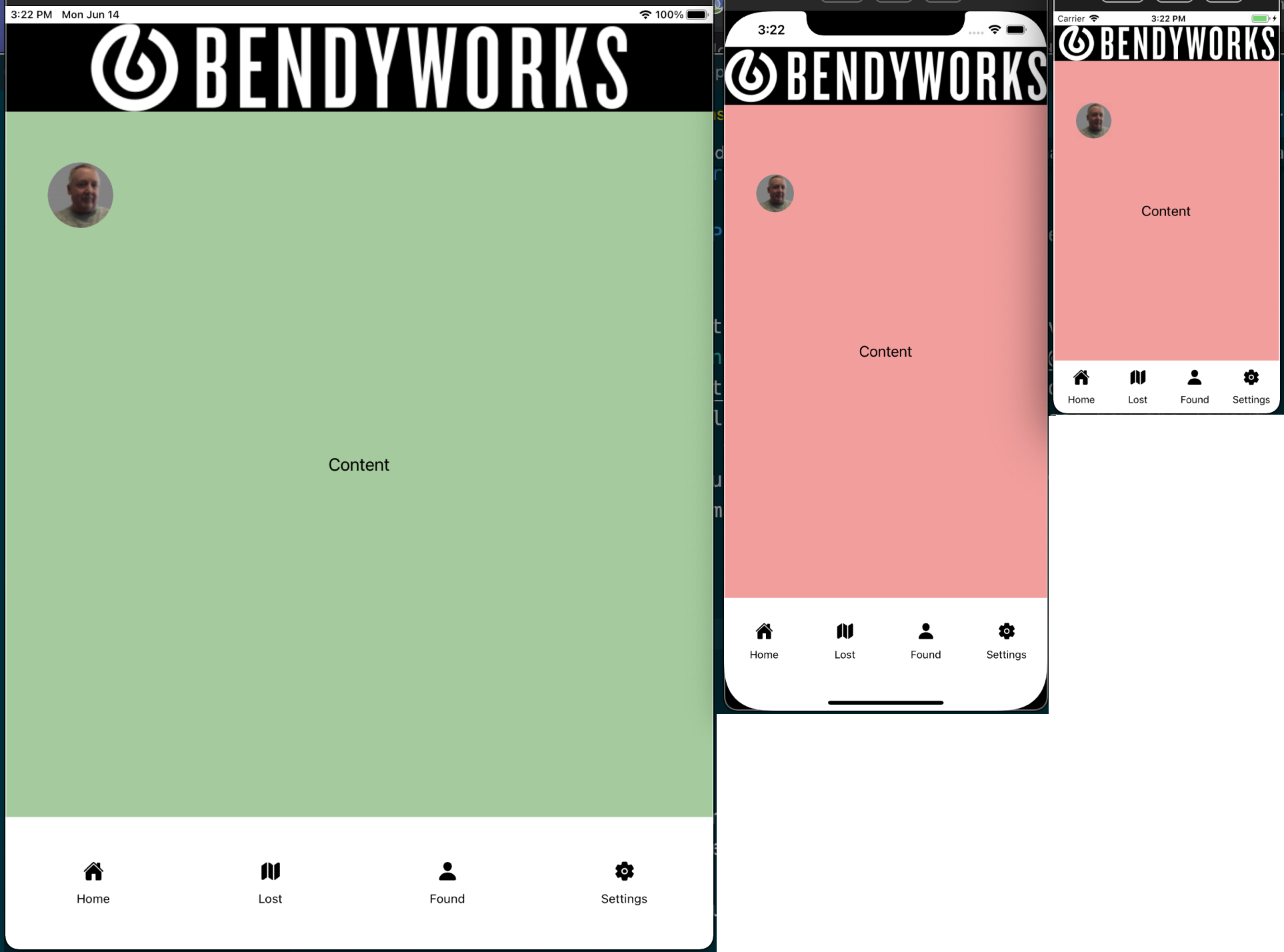
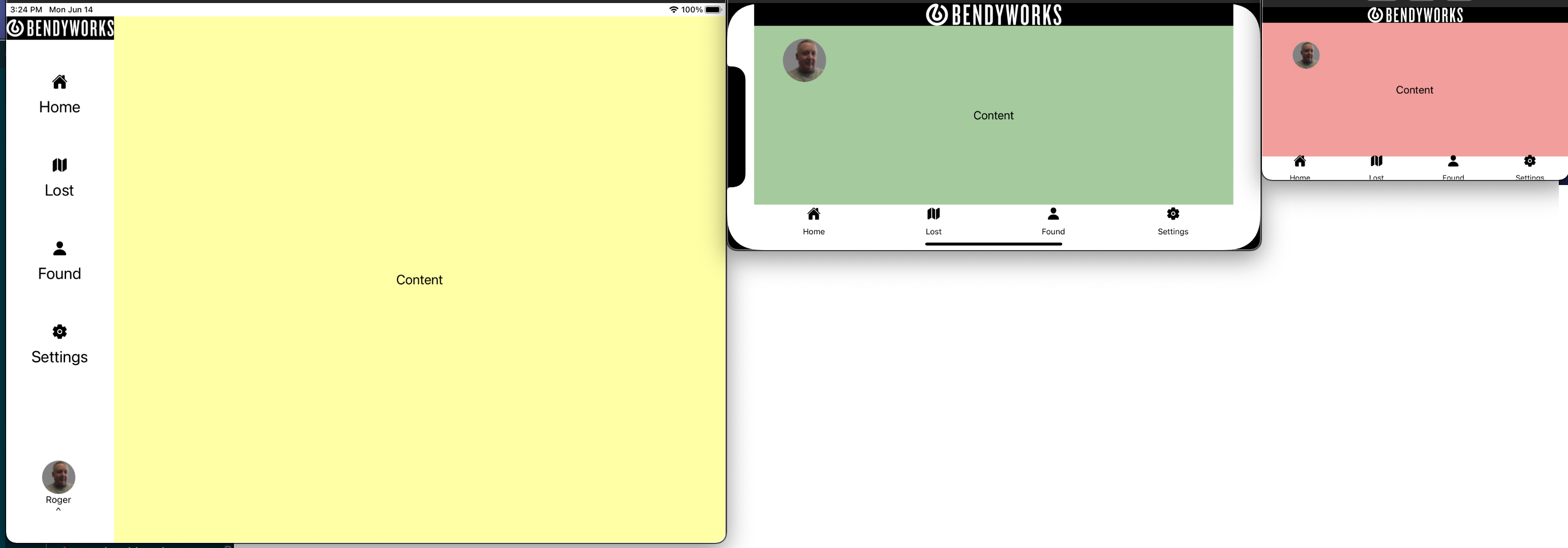
We can put this all together to make a much more responsive React Native app. Please check out the Snack with all the code for this post. You can pop out the preview and play with the window size to see how the layout adapts. To see it on device, you will have to download the snack and view it in whatever devices and emulators you have handy. To whet your appetite, here are a couple images showing the various ways the layout adapts.
Portrait
landscape
Links
Before embarking on this journey, I wandered around the internet a while looking to see how others have approached this. I didn't find anything that did everything I wanted, but I did find a bunch of different approaches that might be useful.
- How to Build Responsive React-Native Apps?
- How to create responsive layouts in React Native
- How To Make Your React Native Apps Responsive
- My React Native Stack After 1 Year
- Handling responsive layouts in React Native apps
While I was researching this topic I also ran across a couple library options that have some really nice features related to this topic. Check out react-native-responsive-ui and Restyle (by Shopify) as more nicely packaged alternative to some of the concepts presented here.